UI Design: Property App
Property investment is a big financial commitment for a lot of people. It could feel so much or so little information available. This app is designed to help people navigate with confidence in an ocean of property information.

The Goal.
Design a responsive web app that provides information on properties of interest, primarily for new, small-scale property buyers who are looking to invest for additional income or financial security.
Persona & User Stories
To achieve this goal, a user-centered design is adopted, starting from a Persona:
Rashida is an IT consultant for a growing tech company. She is frequently on the go, and often holds meetings by phone in her car while driving. She is good at multitasking and relies heavily on technology to help her with this.
and user stories:
“As a user, I want to create a profile containing all my property criteria, so that I am recommended results most relevant to me. "
“As a user, I want to be able to save or mark properties I am interested in, so that I can easily revisit them.”
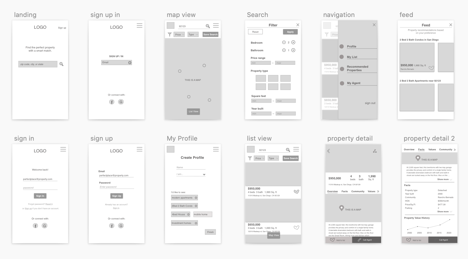
Low Fidelity Wireframe
With Personas and User Stories in mind, my next step was to create low-fid wireframe to visualize the flow and gather immediate feedback.

Mood Board: Credibility, Trust, Joy
Home investment is about future planning for family. We want to communicate not only credibility, but also brightness and joy through the design and color palette. The midnight blue conveys credibility and trust-worthiness, while the dark tangerine / mango color brings out brightness, hope and joy.
Wireframes.
As the design progressed from low, mid to high fidelity based on feedback received, it’s tempting to fit all property information and crowd the UI. To avoid that and maintain user focus, the navigation is consolidated and left with main features and categories that would be heavily used.
Gray scale mid-fidelity wireframe

Color mid-fidelity wireframe

Color mid-fidelity wireframe

High fidelity wireframe

Responsive breakpoints.
Because property apps tend to cramp the UI with a large amount of home property information, a mobile first approach is effective with content priority and responsive breakpoints in this case.


Lessons Learned
Since this is a project for a UI crash course, it’s difficult to make certain decisions without stakeholders to weigh in. So, I asked my course mentor to act as a stakeholder and provide input on the mood board and color palette.
This turned out to be an incredibly helpful exercise as I get to understand the why behind each preference from another perspective.
Get unstuck by asking stakeholders’ input early and frequently. It should feel like taking a step back and seeing the full picture.